Once you’ve been in IT for a while you get really offended by sucky user interfaces. For quite some time the rank of worst user interface in the history of man was held by the Yahoo redesign team. The previous interface wasn’t pretty, but at least it had everything one would need to do proper investing. Now it has the second ugliest interface ever and is fill with nothing but pump & dump paid advertising. No investor should ever go there.
I was at an advertising client a while back and they kept sending an email out to everyone touting that the guy responsible for that wretched design was coming to give a lecture. My first thought was “unless you’re trying to teach the kids working for you what not to do, why have him?” My second thought was “I hope he isn’t getting paid.”
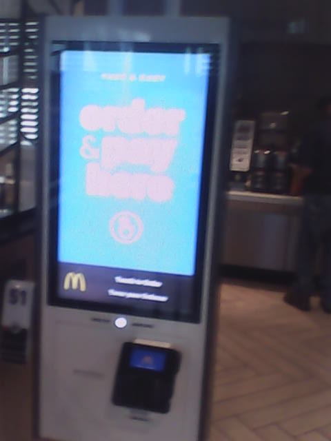
Hopefully you can see the featured image of this post. It is the “new” kiosk McDonald’s seems to be rolling out. This is the UI which has unseated Yahoo in the worst of the worst category. My first encounter was quite a few months ago when I took my mother to an eye doctor appointment up north. The register worker, who apparently had been trained by corporate management on how to use the kiosk took me over to place my order there. They must have been getting bonus points or something for walking people over to that bastion of inefficiency. After 5 full minutes even she couldn’t find what it was I wanted on the thing, so we went back to the register and I ordered like a human.
 Adding insult to injury, McDonald’s seems Hell bent on taking fast out of fast food. My first exposure to this was about a month ago when some fool was at the front of the line trying to order what felt like a dozen custom coffees. Oh, they aren’t coffees anymore. They are espressos, lattes, and half a dozen other names for beverage of the damned. I gave up, walked out, and drove across the highway to Hardees. I only went into McDonald’s because it was next to the Marathon station with the cheapest gas price.
My second exposure came recently. The Subway doesn’t open early enough for me to get a sandwich on Sunday morning. Hey, they want one day to sleep in, I can understand. I should be thankful they open in the morning at all given corporate now made serving breakfast optional for franchise locations citing a shortage of labor in many markets.
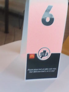
I went to the counter and ordered the very diabetic friendly steak egg and cheese sandwich meal. I expected to just be handed my ticket and told to stand over at the pick up spot when I was handed this number. I was then told they would bring it out to me. That’s when I sat at a table for 10 minutes (I checked the time) before my meal arrived. I guess there were other fools ordering dozens of custom coffees after me and that occupied all of the help.
Thanks to the shitty service and worse kiosk, Subway has been getting a lot more business. If you want to make money with your Subway franchise, make sure it is next to a McDonald’s. You can get a sandwich faster at Subway. Hopefully Subway doesn’t start catering to the damned by adding fancy coffee.
