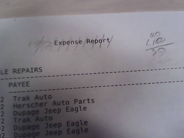
 Before I get into more coding on this topic, I need to cover some remedial information. The first is how we center a heading. Even when we had printer spacing charts we would write the text on scratch paper then put a slash every two characters, counting spaces as characters then we would count the slashes. When working with narrow form we would subtract the number of slashes from 40, with wide form it was 66. That gives us the position of the very first character. Once again, COBOL made this simple.
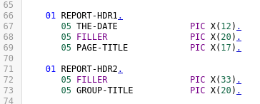
Things tend to get less obvious if you are using C++ and trying to use the approved Qt methods of building a string.

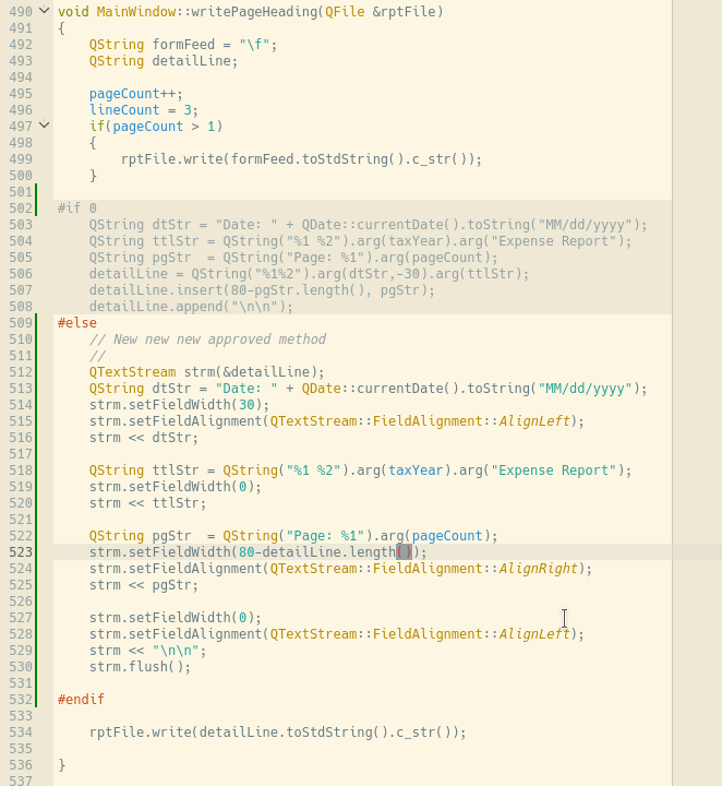
That’s why the early xpnsqt version built the report heading this way.

It’s a bit more human friendly. In the days of C and even early days of C++ developers would just use sprintf() with a format string. Admittedly, it got ugly. More of us switched to the example above because even a junior still in school developer could fix a spacing problem. QString does provide apsrint but we are told not to use it.

There is a new new new approved method as well.
Honestly COBOL is starting to look like a higher level language for reports, probably why COBOL will outlive Java and every scripting language in vogue today.
Many Qt developers try to get around such things by writing html files. At first blush it doesn’t seem too horrible. Headings don’t get too complicated.
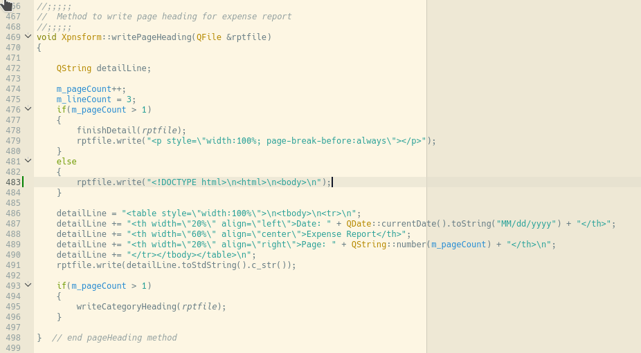
You will note the use of tables to control positioning. The knee-jerk sizing width 100% really bites you if someone clicks the full screen button though.

I don’t know about you but “Total” kind of disappears for me. It’s also very difficult to follow the line across the screen.
The real killer is dealing with all of the tables because that is your only real method of creating column alignment.
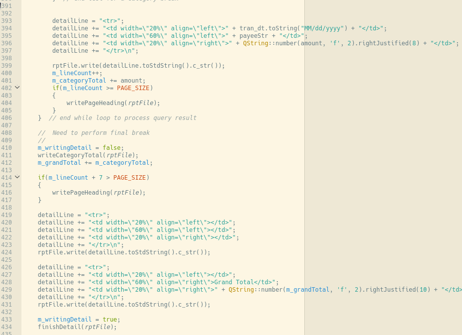
That funny looking piece of code from 419 to 423 creates the blank row between category total and grand total lines. In theory a single string of “<tr></tr>\n” should have worked, but not in all browsers. Keep that in mind. It may look perfect in your application, but if you don’t delete the file someone is going to try looking at it in their default browser if it has a .html extension. You need to keep in mind another thing before clutching html as “the solution.” Much of it is going away with html 5.
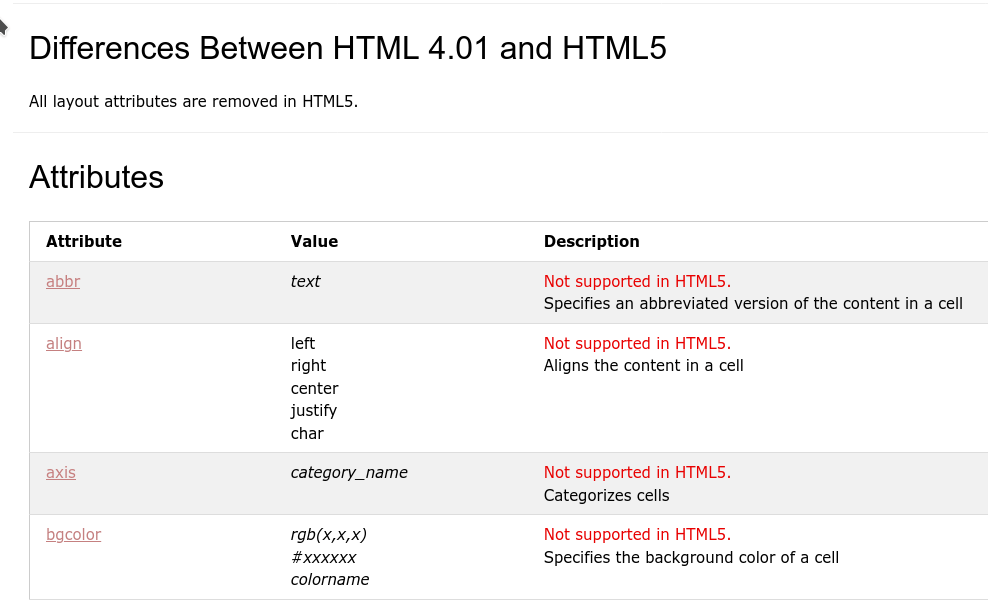
You can follow the link to read up on everything disappearing from <td> when the browser supports only html 5. I included this snippet because the code made heavy use of align to make the report line up. Still, forcing the font to Monospace 9 point allows creation of a passable report for this purpose.
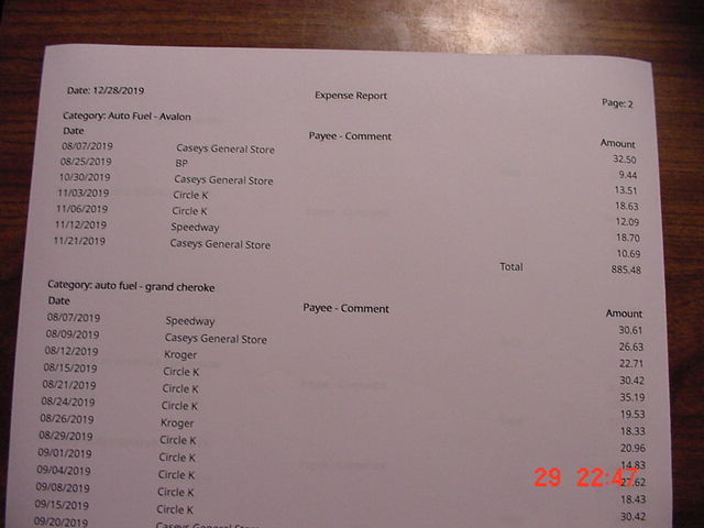
You will note the page breaks occur as expected. Yes, there is a touch extra space at the top of the second and subsequent pages. It can be fixed and it is good enough for this example.
We need to look at just how bad things can get before I end this post. Click this link to be taken to the Edgar database for Oxford Square Capital Corp. (OXSQ). I gave you the company name in case the Edgar database moves or something. You will see a page looking much like this.

Click on the 10-Q html document and scroll down to the beginning of page 2, “CONSOLIDATED SCHEDULE OF INVESTMENTS.” It should look something like this.
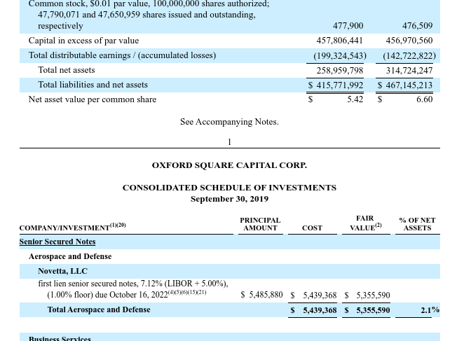
Click your back button then click on the complete submission text file. Search for “consolidated.” You should find something like this.
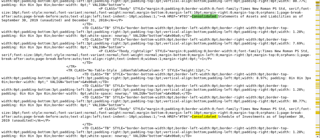
Nice huh? If you go back to the top and search for “T04” you can the later point in the file where they wedged in the data.
Our discussion for today is over. In case I don’t get back to this before New Year’s Eve, have a happy happy!